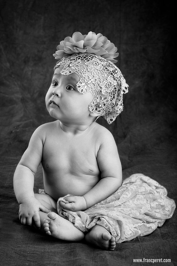
Achieving a vintage feel
Tweaking images had always been part of photography, long before the existence of digital file and Photoshop type of software. There is nothing wrong about it, as soon as you exactly know what you are doing. Thus, you need a clear vision of your concept from model, background, accessories, lighting and shooting style.
By Franc Peret
Experimenting with cameras, lenses, point of view, composition, flash, lighting, natural light, structure, model or actors always feed my interest in film making and photography.
Last but not least, post processing is the ultimate touch I can add to finalize my original concept.
I am using my 2 favorite software to do so: Photoshop (for pictures and video) and Premiere (for video).
I am working with no more than 10% of their capabilities, but they already allow me to to get closer to my initial ideas, to push even further my interpretation or to create an unexpected result.
Most Important before using a post processing software is to get a concept in mind.
For this series of vintage shot of my little one, I had an idea in mind and this drives most of my choices: background, clothe and accessories, point of view, lens choice and lighting.
Lighting is a bit specific as shooting a little kid is not the same as shooting an adult. You have to be prepared to get her face turning around and therefore to light up the scene from both direction to get a pleasing result wherever the little model is looking.
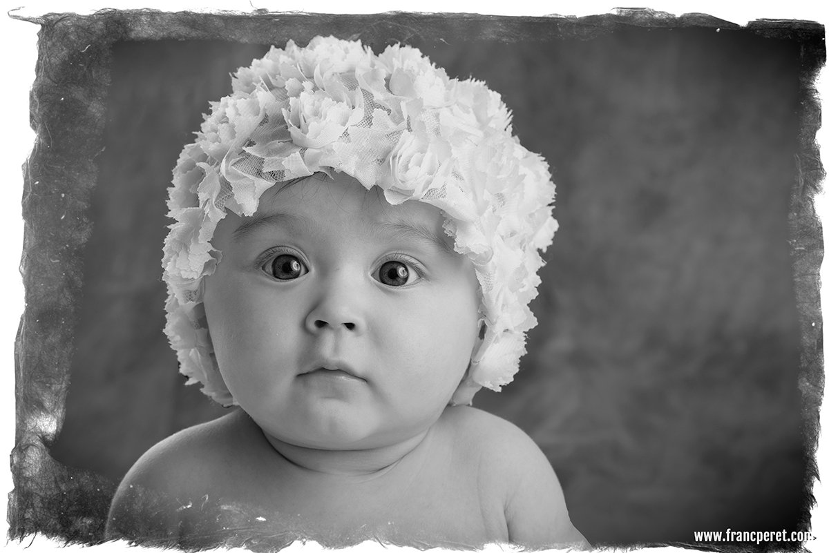
Difficulties in post processing is options. They are endless and sometime a break is welcome to leave the creative process for a while and to come back few hours later with a fresher mind a more critic eyes.

The first treatment is softer with a frame to get a “coming from the past” feel, while this one is having more details and higher contrast. Hard to decide which one is working the best…
Key light and fill light should not exceed a 1:2 contrast ratio with the kick light in the same range to detach her silhouette from the background without burning the reflected highlight on her skin.
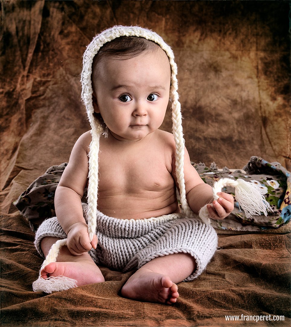
Sometime, I prefer to keep the color version, all depends on the composition and the facial expression.

Black and White is logically associated to the concept of vintage, but colors matter a lot as a starting point as they do not translate in the same shade of grey compare to the skin.
To achieve such a smooth light set up, I used 3 flashes:
The key light was bouncing inside a huge soft umbrella which behave like a 1.5 meter wide beauty dish (positioned on her left side, next to my right shoulder).
The fill light (which was also used to light up the background) was bouncing in the opposite corner of the room (facing her high, on her right side, over my shoulder).
The kick light was bouncing against the white wall behind her (high, on the right side of her back).
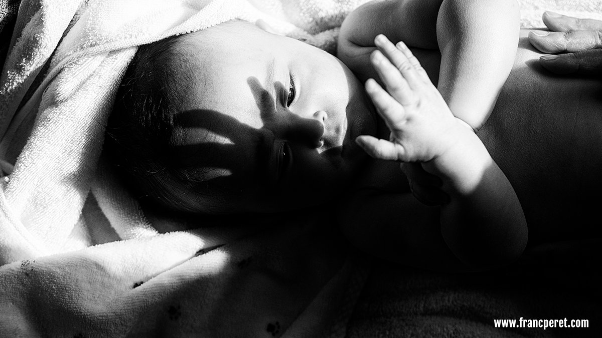
The sun is usually my best friend to shoot Apolline discovering her new world. Panasonic GM5 1/2500s ISO100 and OLYMPUS 45mm f/1.8 @ f/1.8
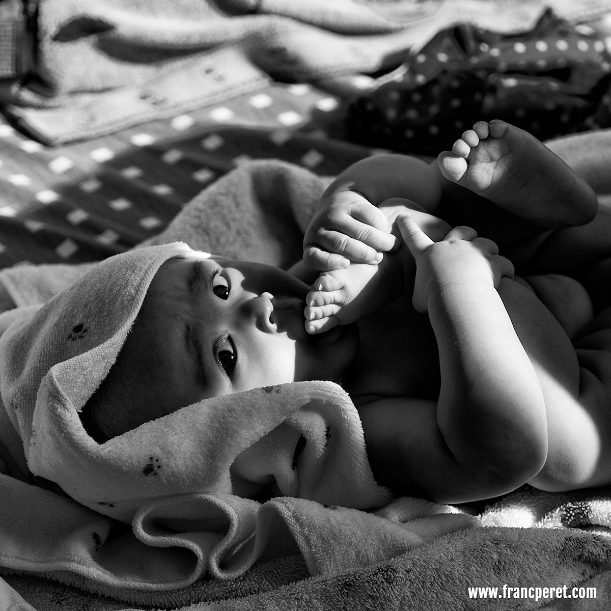
To tell the truth, I much more used to shoot pictures of my little one in natural light, on the fly, when magic happens. I had to force myself a bit to start that “studio series”, but I finally enjoyed the experience very much and I will redo it again. Panasonic GM5 1/800s ISO100 and OLYMPUS 45mm f/1.8 @ f/2.2
Final touch, she was surrounded by white reflector panel to not get colored shadow form the wood furniture around.
I forgot to say that this set up was done in my bedroom and not a studio and my bedroom is quit small…
For that “studio session”, I used my Nikon D750 (ISO100) and a great old zoom lens (AF-S f/3.5-f/4.5 28-105mm D) set at f/8.
With such a cute model and good pictures to start with, it was very inspiring to play around with different photo treatment in post processing, to achieve the vintage look I was after.

A little girl is just an amazing subject to shoot with so many different expression waiting to be recorded. Panasonic GM5 1/500s ISO100, LEICA DG NOCTICRON 42.5mm f/1.2 @ f/1.2

After shooting that studio session, I got used to treat my image different ways according the facial expression, my mood and type of lighting falling on her. Panasonic GM5 1/320s ISO100, LEICA DG NOCTICRON 42.5mm f/1.2 @ f/1.2
From start to end, I had something in my mind and I just made it come alive by adjusting every steps of the process in the same direction.
FP
Former photo journalist, Film maker and ELC Shanghai Photography teacher, Franc Peret is teaching Essential Photography Classes, Advanced Photography Workshop and Film Making Classes in Shanghai, for the last 11 years.
If you wish to contact Franc, just drop an email to francperet@hotmail.com


